Welcome to my class: « Introduction to makeup colours 101 » ;-)
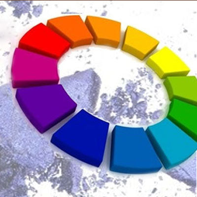
In this class, you’ll learn about the basic makeup colours. When you know the rules, you can match your clothes, hair and even your accessories with your makeup and at the same time learn how to wear flattering eye makeup and foundation, even use makeup for different parts of your body, just by the simple use of colour. Makeup artists, as well as working with their creativity and talent, use some basic rules when working with colour. Here then are the two most important ones. To understand them better, please refer to the chromatic colour wheel. You have to know that the wheel only contains primary, secondary and tertiary colours and that’s only an infinitesimal selection of available colours. So you have to imagine that your desired shade may lie between two colours or may be influenced by mixing it with white or black. This class is easy, there are 2 basic rules!
Rule 1: warm and cool tones
To understand the difference between warm tones and cool tones, we’re going to use an image.
For warm colours, think fire, for cool colours, think water.
On the chromatic colour wheel, the warm colours are on the left half, from greenish yellow to red. Cool colours are on the other half, from green to reddish mauve..
What you have to know about this rule is that any colour can be warm or cool, depending on its undertone. For example, if you take yellowish green and bluish green you have two shades of green but the first is warm (because it contains yellow and makes you think of fire) and the second is cool (because it contains blue and makes you think of water.) When you understand this, it’s easy to match colours. Stay in the same category and your colours will be harmonious. For example, if you want to match your makeup with your new purple shirt, it’ll be easy if you use cool tones.
Sometimes it’s difficult for beginners to tell the difference. With practice, your eye will get used to detecting the difference between warm and cool tones. Some pinks for example can be difficult to categorize. There are cool pinks with a bluish undertone, and warm pinks with an orange undertone. If in doubt, stay monochromatic and add a neutral touch (grey, fawn, taupe, chocolate, black etc.), noir, etc).
Rule 2: complimentary colours
This is the part I like best. Most makeup artists work with complimentary colours. You can work magic when you understand this concept.
A complimentary colour is the one which is exactly opposite the other on the chromatic colour wheel, for example, mauve and yellow, green and red, blue and orange and so on. You have to memorize the wheel. When you put two complimentary colours together, they increase in intensity for the observer.
Also, when you layer one over the other, the complimentary colours cancel each other out. This optical effect can be observed with coloured spotlights. If you direct a green spotlight on the stage and then add a red one at the same place, you’ll have no colour at all.
So using these two rules in makeup gives you infinite possibilities.
You can use different shades of the same colour side by side to flatter the eye colour (duos, trios, quartets…) etc. But don’t use only THE ONE complimentary colour situated opposite our base colour. Look at the two or three colours on each side of our principal complimentary colour. I’ll say it again; the colour wheel is basic and doesn’t contain every complimentary colour.
The exercise is simple. Let’s say you have blue eyes. Look at the colour wheel and look at the main complimentary colour. It’s orange. If you go a little further, you’ll see that copper tones related to orange, such as yellowish-orange, reddish-orange, ochre, gold and coral are all great with blue eyes. That doesn’t mean you should always use these colours. The rule just helps you to make a choice. Some other factors apart from the colour of the iris should be taken into account such as under-eye circles, redness, clothes, lipstick, blush, etc. For further advice on the ideal colours to use for eye makeup, click on this link.
When it comes to layering colours, the rule is very useful. You can use it to correct the complexion, imperfections or under-eye circles etc. For example, let’s say you have a big red pimple on your chin. Check out the colour wheel. The complimentary colour fro red is green. If you apply a green corrector on your pimple, you’ll cancel out the red and it will be less visible. It’s the same for bluish under-eye circles which need an orange corrector or violet circles which need yellow. If you’re not sure whether your under-eye circles are blue or violet, a yellowish-orange corrector should work.
Obviously, these rules can be applied in many different ways and of course there are exceptions to every rule, but I believe that the colour wheel is a good guide and can give you serious help in case of uncertainty.